Unsurprisingly, the US elections dominated the news and data journalism over the past two weeks, with print and online media awash in red and blue maps, explanations of the electoral college system and swing states, and recaps of the results. Naturally, several data projects related to the election feature in our final, regular data journalism column of 2024. (Look out for our Best of Data Journalism in 2024 column next month.) The New York Times analyzed Democratic and Republican voters; The Washington Post mapped the counties that secured Donald Trump’s victory; the Associated Press looked at how five demographic groups voted. Still, other topics were covered. This edition of our Top 10 in Data Journalism, which considered stories between October 28 and November 10, also highlights an El País mapping of the destruction caused by floods in Spain; an investigation by InfoAmazonia into environmental offenders financing electoral campaigns in Brazil; a Financial Times analysis of attacks on health facilities in Sudan; and a fun explanation from The Pudding of the dynamics of standing in line.
Where US Voters Shop, Eat, and Live
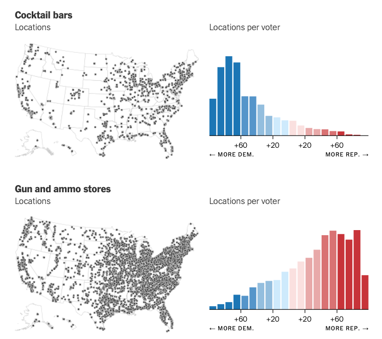
In the week and days leading up to election day in the US and Donald Trump’s victory, data teams analyzed various aspects of American society, mostly economic, that could tip the scales for one candidate or the other. In this piece, however, The New York Times takes a different view, showing a series of maps of where Democratic and Republican voters shop, eat, and live. There are some interesting comparisons, such as how places with more yoga studios and cocktail bars tend to be deep blue areas, where Democratic-voting people live, and some obvious ones, such as that areas with more gun shops and farms tend to be more red, or voting Republican. But the Times notes that some metrics are hard to measure — such as the voting inclinations of McDonald’s consumers or Baptist churchgoers — because McDonald’s branches and Baptist churches are everywhere in the United States.
County Shifts That Secured Trump’s Victory
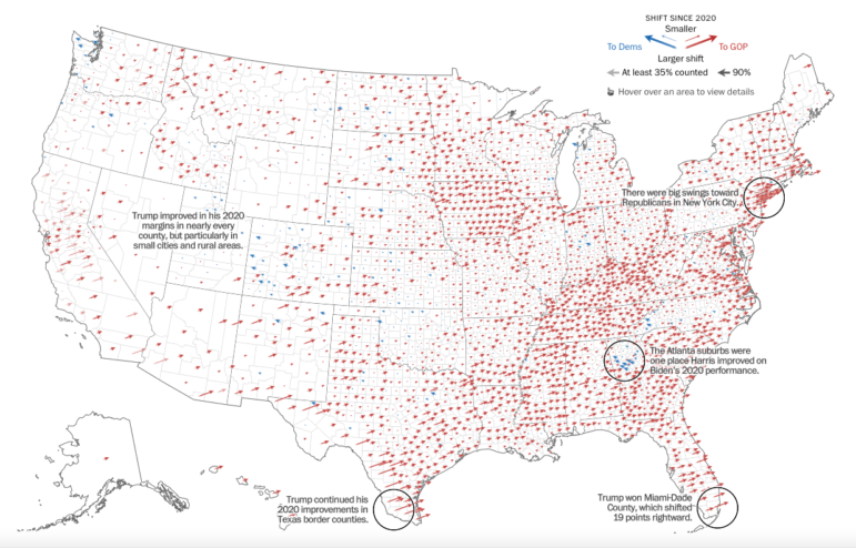
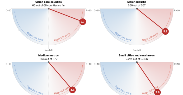
In the weeks leading to the election, polls showed a tight race between Donald Trump and Kamala Harris, with the expectation that the wait for a result would be long, as it was in 2020. But as soon as the count began, Trump’s lead was clear, and victory was soon declared. The Republicans also took control of the Senate and look to have maintained a narrow majority in the House of Representatives. The Washington Post created an interactive dashboard, which is constantly updated, to analyze how counties shifted in the 2024 presidential election compared to 2020. The piece also provides detailed analyses of the changes in each of the seven battleground states. Among the conclusions, it is worth highlighting that, in addition to Trump expanding his margins in rural areas, he made gains in rural communities along the US-Mexico border in Texas, which had already been trending Republican in recent elections. But he also made surprising gains in the wealthy suburbs of Washington, DC, and solidly Democratic counties in New York.
Votes of Five Key US Demographic Groups
According to the Associated Press, former President Donald Trump’s sweeping victory was secured by two factors: the solidity of the Republican voter base and the slight expansion among several groups that traditionally make up the Democratic base. In this piece, the AP shows how five key demographic groups voted: by age, by education level, by race or ethnicity, by location, and by gender. Although the vast majority of Trump voters are white, the Republican won a small but significant share of Black voters — almost doubling his share among the young Black population — and Hispanics, especially young men, despite his promises of mass deportation of immigrants throughout the campaign. In addition, the former president also had narrow growth among men and women overall, with Kamala Harris winning a smaller share of the female electorate than Joe Biden did in 2020. While Harris received 53% of the women’s vote, Biden got 55% four years ago.
US Abortion Rights on the Ballot
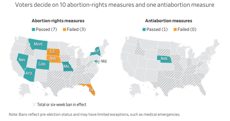
In addition to voting for the presidency, Senate, and House of Representatives, some US states also voted for governor and a vast list of ballot measures related to other issues, such as the legalization of marijuana, LGBTQIA+ rights, and the right to abortion — which has been decided individually by each state since the overturning of Roe v. Wade in 2022. That ruling was made possible by the three conservative Supreme Court justices who were put on the bench during Trump’s first administration. The Wall Street Journal presented a live tracker with detailed results for the 10 states that included abortion on the ballot, explaining what was at stake in each one and showing, in maps, how the population voted in each area. Notably, more than two million voters supported both Trump and access to abortion, as analyzed by outlets such as Bloomberg and Axios, with voters supporting abortion rights measures in several states Trump won.
Flooding Destruction in Spain
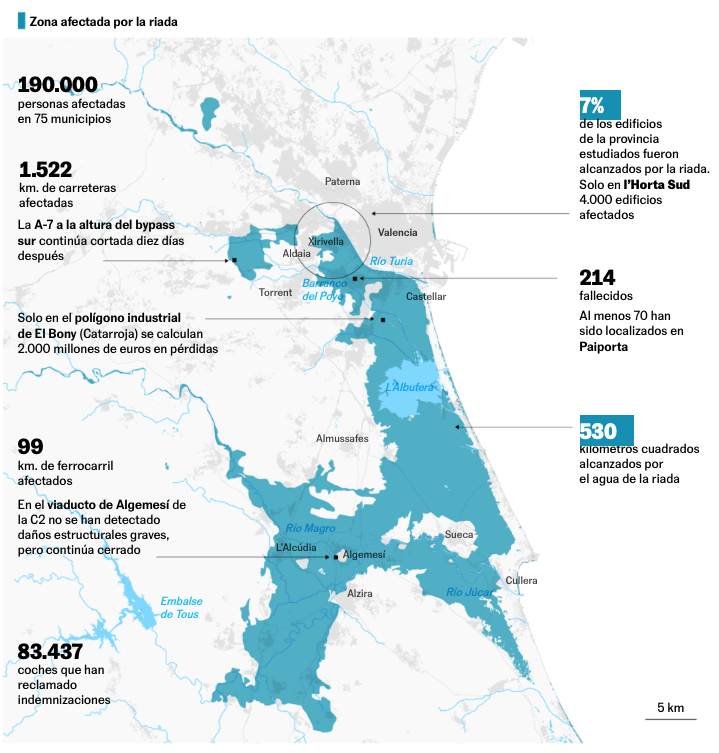
At the end of October, Spain was hit by a natural disaster, caused by an isolated storm depression at high levels — a phenomenon known by the acronym “DANA” in Spanish. Torrential rains caused several rivers and ravines on the Mediterranean coast to overflow, and a series of flash floods hit several communities on the east coast, mainly in the province of Valencia. According to data presented by El País in a series of maps, in addition to the at least 223 confirmed deaths, satellite images and official calculations made it possible to estimate that 1,500 kilometers (932 miles) of roads, 99 kilometers (61 miles) of railways, more than 4,000 buildings, and at least 190,000 people were affected by a flood that extended over 530 square kilometers (207 square miles). According to El País, the damage from the DANA — detected by the satellite mapping system Copernicus — includes different types of buildings, such as residential, educational, commercial, and industrial; the latter two were the most affected.
Ukrainian and Russian Armies Advance
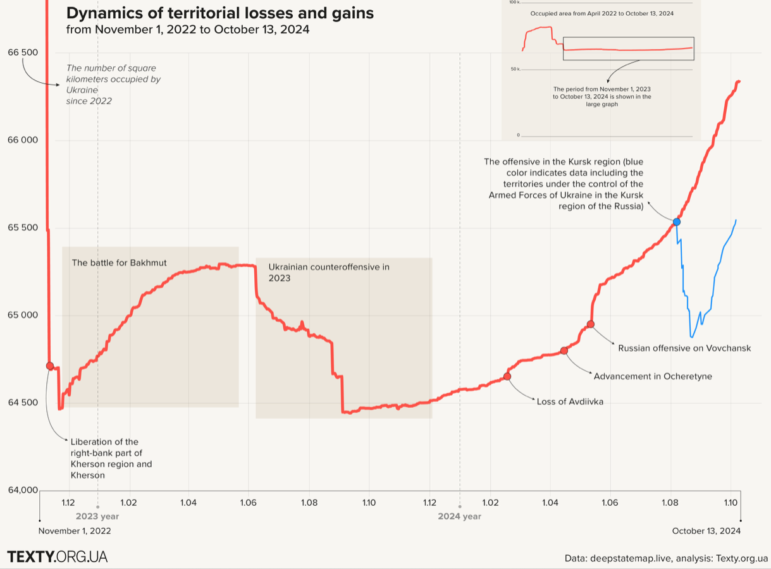
Image: Screenshot, Texty.org.ua
The conflict between Ukraine and Russia is in a period of uncertainty, with the recent rapid advance of Russian forces across Ukrainian territory and the expectation of a possible interruption of US military support for Ukraine now that Donald Trump has been elected US president. Texty analyzed the pace of advance of the Ukrainian and Russian armed forces through human and equipment losses, using data from DeepState, a geopolitics and analytics site, and Oryx, which tracks equipment and weapons losses. The article presents a series of graphs which, according to Texty, make it possible to observe how various events have affected the dynamics of the war, and pinpoint the moment the Russian Army managed to advance faster. To look at the dynamics of territorial losses and gains, the main stages of the Russian-Ukrainian War are presented on a timeline. According to the article, there is also a correlation between progress on the front and Russian casualties, as well as with the loss of armored vehicles and artillery.
Environmental Offenders Donating to Election Campaigns in Brazil
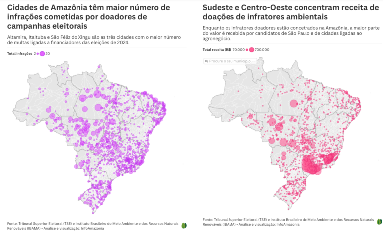
Twin maps showing cities in the Amazon have the highest number of infractions committed by campaign donors (left, purple), and politicians from Brazil’s southeast and midwest regions have the highest concentrations of campaign donations from environmental offenders (right, pink). Images: Screenshot, InfoAmazonia
The Brazilian elections held in October 2024 continue to be analyzed and investigated. InfoAmazonia reveals how many environmental offenders — for instance, those involved in deforestation and illegal mining — donated to electoral campaigns. According to the investigation, these financiers of mayoral and city council candidates owe a total of 1 billion reals (around US$172,000) — 71.8% of which involved environmental crimes committed in the Amazon — and injected around 37 million reals (US$6.4 million) into the 2024 election. The publication featured maps showing the cities with the most environmental infractions committed by donors, those that received the highest number of donations, and information on which candidates and parties received the most money. They also noted the curious stories of environmental offenders who make a hobby of donating to campaigns — such as a businessman involved in the attacks on Brazilian federal government buildings last year, and a man sentenced to 91 years in prison who helped elect 12 city councilors and a mayor.
Health Facilities are Casualties in Sudan’s Civil War
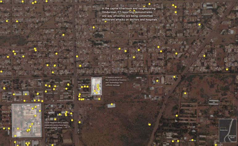
In Sudan, a brutal civil war between the Sudanese Armed Forces, led by President General Abdel Fattah al-Burhan, and paramilitary forces, has been raging since April 2023. An estimated 150,000 people have been killed since the conflict began. But the war is also having a devastating impact on healthcare facilities in the country of 49 million people, according to an analysis by the Financial Times. In its special report, the FT mapped bombing damage geolocated on the city of Omdurman, which neighbors the capital Khartoum, and shows how many bombing sites coincide with the location of hospitals or health facilities. According to the report, doctors and officials say that these attacks are not accidents; militia members are repeatedly and deliberately targeting healthcare facilities, bombing hospitals, and even shooting doctors. According to health officials, around 70 to 80% of Sudan’s health facilities are no longer operating at full capacity at a time when the country is facing an unparalleled displacement crisis, according to the UN, and famine leaves millions in urgent need of care.
Global Questions of Climate Finance
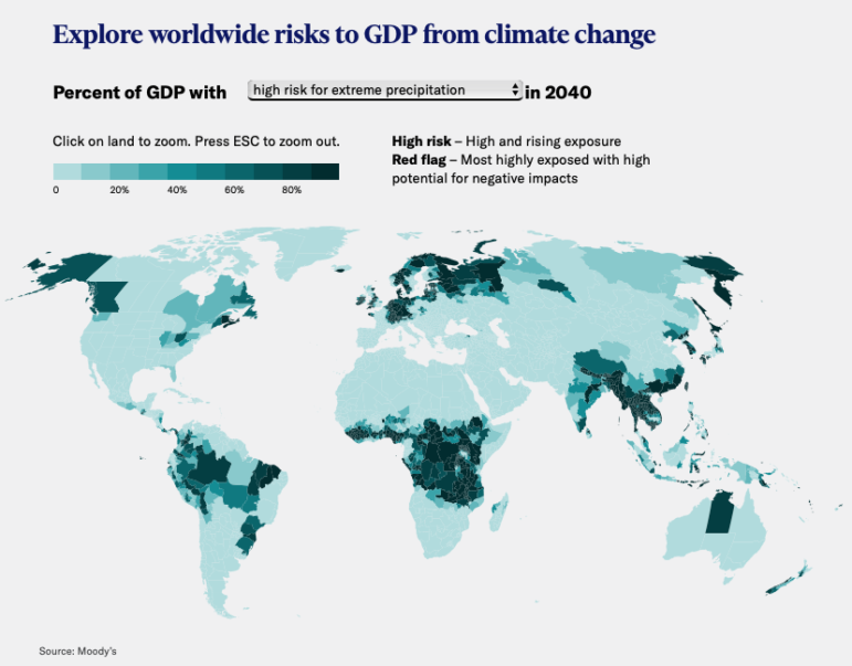
Another topic in the news, but featuring less in data journalism, is the 29th United Nations Climate Change Conference (COP29), which began on November 11 in Baku, Azerbaijan. By the end of the conference, many promises will have been made or renewed. But will they be enough? According to an analysis by Moody’s, there is a funding gap for fighting climate change — a big one. The report states that large sums are needed for the world to reduce its emissions and adapt to the effects of climate change and, although investments have increased rapidly since the 2015 Paris Agreement, they are far from being sufficient. According to the report, the annual climate investment gap would be US$2.7 trillion by 2030 — about 1.8% of global gross domestic product (GDP). For Moody’s, emerging economies will be the hardest hit, but the consequences for advanced economies could also be severe. The report highlights a series of recent climate events in different countries and shows how these extreme phenomena can affect global GDP.
Disappearing Aral Sea
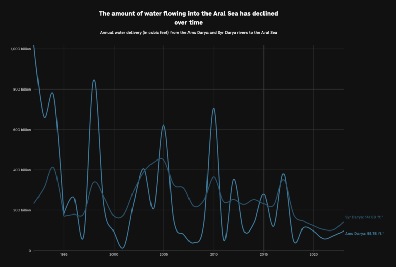
While nearly 200 nations are discussing their climate pledges in Baku, not far away on the border between Kazakhstan and Uzbekistan, the Aral Sea — once the world’s fourth-largest saltwater lake — is disappearing. In a visual explainer, NPR showed, through charts and stunning satellite images, how the body of water in Central Asia has been drying up for 60 years. Fed by two headwater rivers that flow from glacial mountains and pass through six countries to bring fresh water to the salty lake, the Aral Sea split in two in the late 1980s when water levels became too low. According to the report, this is partly due to the diversion, damming, and draining of the rivers to grow cotton in the desert. Since then, the North Aral Sea in Kazakhstan has remained intact, mostly thanks to a dam, while the South Aral Sea, mostly in Uzbekistan, has fragmented into several smaller bodies of water, with dozens of abandoned structures along its banks in what was once a port city. According to NPR, the shrinking of the lake has altered the regional climate and threatens the region’s future.
Bonus 1: History of Tour de France Routes
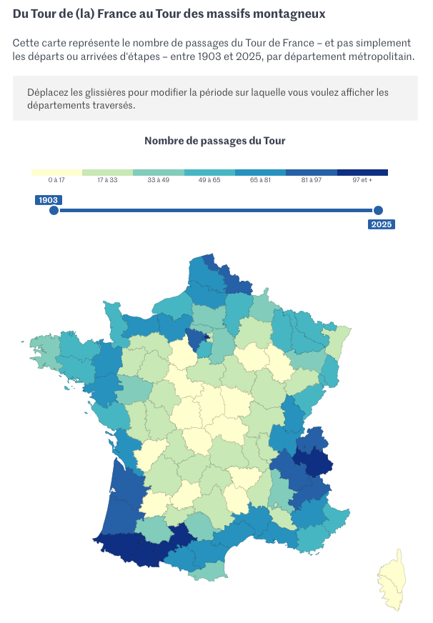
The route for the 2025 edition of the Tour de France, one of the world’s biggest cycling competitions, was recently announced. To mark this news, Le Monde collected data on all the Tour de France stages since the inaugural race in 1903. It created a list of the departments (administrative divisions of France) that cyclists have crossed each year and an interactive map of the passages through each region. According to the analysis, despite the event’s name it has been a long time since the route traced a perimeter around France; from the 1960s onwards, the routes became increasingly “exotic,” with the arrival of half stages spread throughout the day and increasingly frequent passages through France’s central mountain region. Le Monde even suggests that the event has gone from being a tour of France to a tour of mountain ranges — with the Grand Départ, as the start of the route is known, sometimes taking place in neighboring countries. Which departments feature most or least frequently? Paris leads the former category, with the capital being left out of the tour only this year — due to the Olympic Games. The least-cycled department is the Mediterranean island of Corsica, which has been on the tour route only once in the 112 editions of the event.
Bonus 2: Science of Waiting in Line
Have you ever joined a line, and felt like the other line was moving faster? This perception is common, and in some cases, even true. In this engaging video, The Pudding brings in an operations management expert to explain why lines are so complicated and uses examples of lines we have to stand in at airports — the check-in line, the line to buy overpriced snacks, or the immigration line — to explain how the dynamics lines work and how one can be more efficient than others.

