For GIJN’s My Favorite Tools series, we spoke with Bloomberg data journalist Leonardo Nicoletti, whose recent projects have dug into extremism on social media, race, and gender stereotypes in generative AI, and the US opioid epidemic.
Nicoletti took a roundabout route into the journalism profession — working for many years in academia. But even as a student, he had an eye for visuals.
“When I was a student I was doing a lot of photography, mostly street photography. I was really passionate about that and I still am,” he says. “I think that’s where I realized that I was really interested in telling stories, human-focused stories.”
After graduating, he went on to work in academia, using open source technologies to measure inequality in cities and quantify challenges relating to environmental vulnerability. “During that time, I became fascinated with data visualization and how we can use it to communicate complex ideas or topics to a more general audience. And I started building applications on the web.”
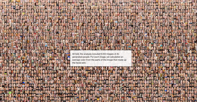
Nicoletti broke into journalism full-time after co-authoring a 2022 visual essay for The Pudding on the representation of women in the news, joining Bloomberg later that year. His work has since been recognized globally, in particular his research on generative AI and the impact of text-to-image models in magnifying stereotypes about race and gender. His story for Bloomberg, Humans Are Biased. Generative AI Is Even Worse, which he worked on with colleagues, went on to win the Sigma Award in 2024.
“It was the first data-driven investigation, at least in the journalism space, that looked at image generators and quantified on a pretty large scale the gender and racial biases within them,” he explains.
Nicoletti’s work has received numerous other accolades such as from the Society for News Design, and his work, in particular on the risks of generative AI, has been cited by the United Nations and the IMF.
His work at Bloomberg has led him to drill down into the issue of tech accountability, putting the impacts of technology on people at the forefront.
“A Bloomberg story is not necessarily a financial story, but it always has a business angle or some sort of money angle,” Nicoletti points out. “That can seem restrictive, but what I’ve learned is that it’s not, because almost any story can be tied to a company or some sort of economic trend or money flow.”
He has produced a diverse range of recent stories, from a report on how OpenAI’s GPT leads to racial bias in recruitment, to a data investigation on how AI is “wreaking havoc” on global power systems, to a look into how hidden fentanyl is driving a fatal new phase in US opioid deaths. Below are some of his favorite tools.
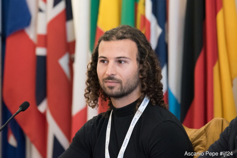
Leonardo Nicoletti at the IJF festival in Perugia in 2024, where winners of the Sigma Awards discussed their work. Image: Ascanio Pepe for IJF, used under a CC license
Python
“Because my work is in between analysis, data investigations, and also data visualization and interactive graphics, I’m using a lot of programming languages and tools that are related to data science, mostly Python and R — I usually use Python most of the time,” Nicoletti says.
“I have Jupyter notebooks and the code, and use regular Python libraries like pandas and geopandas,” he adds. Pandas allow for the analysis of large datasets via structuring and manipulating and transforming data, and geopandas make it easier to work with geospatial data in Python.
He said he also uses spaCy, an open source Python library designed for processing large volumes of text and building natural language processing applications, for example, categorizing text such as speeches based on sentiment analysis, which can be used to determine the tone or opinion expressed.
“Sometimes we’re doing natural language processing, so I’ll use things like spaCy and whatever is needed for the project, but mostly data analysis in Python, and web scraping sometimes is really useful,” he says.
D3.js and Svelte
D3.js is a JavaScript library used to create custom graphics for the web. It allows for complete customization of visualizations.
“Building data visualizations and interactive graphics on the web is all done in web languages. So it’s all JavaScript, HTML, CSS. And then these really useful JavaScript libraries like D3,” Nicoletti notes.
Svelte is an open source JavaScript framework to build web applications with an interactive design, which will automatically update user interfaces when the underlying data is changed.
“It allows you to create web pages that are really reactive. You can build a lot of interaction in a very streamlined way without having to think about very tedious web-based things. It kind of handles that for you,” says Nicoletti.
“It makes it much easier to do transitions. For example, if you have a scatter plot and every dot is a country and then you want to move all those dots into actual countries, then you want to move them all into bar charts. For the Stable Diffusion piece (see video below) — or if you look at most of the stories I’ve worked on — there are a lot of animations and a lot of transitions. All of that is done basically by combining D3 to kind of calculate where the position should be and then using Svelte to smoothly transition those data points, such as if the user has scrolled past a specific point on the page.”
- Stable Diffusion video
QGIS
QGIS is open source software and a popular tool for anyone interested in mapping without having to fork out on proprietary software.
“My philosophy is always using open source as much as possible because then you can reuse it. You don’t have to depend on whether the service’s API [Application Programming Interface] changes. You have less dependence and you also have more freedom,” Nicoletti explains.
QGIS can be used to analyze and edit almost all forms of map and spatial data using vector and raster data.
One of Nicoletti’s personal projects used QGIS to map cities all over the world that provide their residents with services that are accessible within a 15-minute walk. City Access Map, used Mapbox, but a lot of Nicoletti’s data exploration was done in QGIS. “I wrote a Python script that would use QGIS functions since it has a lot of really heavy geospatial functions that are not always implemented in Python. I had something like 11,000 cities worldwide. So the data was huge and it worked most efficiently,” says Nicoletti.
“I use QGIS quite a bit for just exploring data and sometimes I just want to put data on a map and see what it looks like and zoom in so that’s really useful,” he adds. “There’s also a lot of plugins in QGIS. Sometimes there’s things that are much easier to do with QGIS scripts than in Python.”
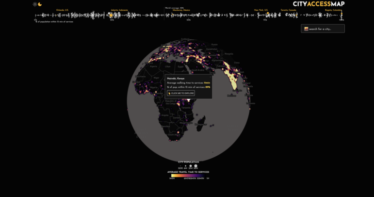
Nicoletti’s CityAccessMap offers a global perspective on the population centers that provide residents with services accessible within a 15-minute walk. Image: Screenshot, CityAccessMap
HTML Canvas
The HTML “<canvas>” feature makes it possible to produce dynamic interactive graphics for the web. As it is raster-based, it is often used for more complex visualizations and animations. Using JavaScript makes it possible to draw graphics directly to a website.
“Most visualizations use SVG [scalable vector graphics] but that can’t really scale well to a lot of data points,” says Nicoletti. “For a lot of the stories I’ve been working on, I’ve been using this other web technology called canvas which is not vector, but pixels. And, so it actually draws the shapes, but it can handle a lot more data points. It’s a little bit harder to use, and understand programmatically, but it’s very, very powerful.”
Interdisciplinary Mindset
Outside of the traditional data analysis and visualization tools that Nicoletti employs, he also advocates having an interdisciplinary approach to coming up with and producing stories.
“I think having a background in social sciences is really helpful. I think learning some data science and programming is really important in terms of the tools you use,” he says. “But as someone who has studied other topics, such as urban planning and the socio-technical challenges in cities, I think it’s really helpful because you learn a lot about very complicated issues and that’s an advantage in coming up with ideas and just having more knowledge about the world.”


