In 2024, there was no shortage of data journalism projects that produced captivating storytelling on a diverse range of topics and events. But with around half of the world’s population voting this year, it’s not surprising that elections were the topic covered most in our columns, appearing in 30 of the more than 200 pieces we selected from more than 80 different media outlets. Other popular topics included climate change and related extreme weather events; the 2024 Summer Olympics in Paris; the conflict between Israel and Hamas; and Russia’s invasion of Ukraine, now heading into its third year.
In 2024, we published 21 editions of GIJN’s Data Journalism Top 10 column. Here, we bring you a list of highlights from what we’ve curated throughout the year — and a fun special report that was published after we wrapped up our regular columns.
Elections
This subject recurred the most among the articles we analyzed and selected for our columns. Here, we highlight the elections in the US and Germany.
United States: Similar to the Hillary Clinton-Donald Trump presidential election in 2016, this year’s polling did not predict a clear-cut victory for Trump, who ultimately won all the battleground states — although the popular vote margin was very tight, with Trump winning less than 50% of the vote share. The Washington Post’s interactive dashboard, along with a detailed analysis, showed how counties voted in the 2024 presidential election compared to 2020. According to the Post, the majority of the country’s more than 3,000 counties moved right compared to four years ago, with Trump making surprising gains even in solidly Democratic suburbs of Washington, DC, and counties in New York.
Germany: In Germany, the controversial far-right Alternative for Germany (AfD) party made significant gains in state elections, including securing first place in Thuringia — the first time in post-war history that a far-right party won a state election. Employing a large language model, the Tagesspiegel newspaper analyzed AfD speeches in German state parliaments since 2014 — totaling 340,000 paragraphs and more than 15 million words. They found that the positions of the party, which advocates ideas such as the return of migrants to their home countries, are neither surprising nor new if you look more closely at their rhetoric, which has been “building hate” against foreigners for more than 10 years.
War and Conflict
Wars and conflicts were also well-covered data topics this year, especially Israel’s operation in the Middle East, which appears to be heading towards a war on more fronts, and Russia’s invasion of Ukraine, which recently reached the 1,000-day mark — but there was also space for much lesser-known and reported conflicts such as the war in Sudan.
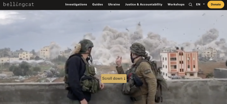
Middle East: Since the militant group Hamas’ surprise attack on October 7, 2023, Israel has launched a relentless offensive into the Palestinian territory of the Gaza Strip, which, in addition to leaving nearly 45,000 dead according to Palestinian authorities, has left an unprecedented scale of destruction. According to the United Nations, Israeli bombings and airstrikes have damaged more than 65% of the structures in Gaza. In an in-depth visual investigation, Bellingcat and Scripps News analyzed the widespread — and often deliberate — destruction of not only military property but also building complexes, homes, and mosques in the Gaza Strip in the first seven months of the conflict. The team used open source satellite imagery to track the movements of a single Israel Defense Force battalion across the region, geolocating online posts openly shared by soldiers on social media. The extent of the destruction is also the focus of this illustrated guide from The Washington Post, which explained in detail the three phases of a possible reconstruction of Gaza, which, according to the UN, could take up to 80 years.
Russia and Ukraine: After the surprise Ukrainian counteroffensive that advanced under the Russian Kursk region, the conflict has entered a period of uncertainty with the recent advance of Russian forces and the expectation of an interruption or slowdown of US military support for Ukraine after Trump takes office early next year. However, as Der Spiegel showed in this explainer, the war between Kyiv and Moscow has increasingly been fought with cheap, improvised weapons, such as small drones — including simpler models such as those usually used for taking aerial images of tourist sites — deploying warheads simply attached with duct tape.
The conflict has also gone through different phases, which can be correlated with the dynamics of territorial losses and gains, according to an analysis by Texty, which looked at the pace of advance of the Ukrainian and Russian armed forces. The main stages of the conflict were presented in a timeline and in graphs that show the relationship between Russian casualties and progress on the front, as well as the loss of armored vehicles and artillery.
Sudan: Since gaining independence in 1956, the African country of 49 million people has been rocked by coups and internal strife, and since April of last year, it has suffered through a civil war between Sudanese armed forces and paramilitaries. An estimated 150,000 people have been killed since the conflict began. The war is also having a devastating impact on Sudan’s health facilities, according to a Financial Times analysis of bombing data in the capital, Khartoum, and neighboring Omdurman. According to the FT, much of the damage coincided with the geolocation of hospitals or health facilities.
Elon Musk’s Politics By Tweet
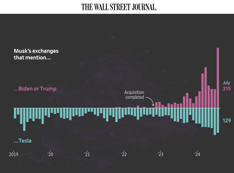
Not long ago, Elon Musk mainly tweeted about his companies, memes, and jokes. But, in the last five years — and particularly since the tech entrepreneur bought Twitter in October 2022 and renamed it “X” — his posts, especially related to politics, have increased. The Wall Street Journal analyzed almost 42,000 of Musk’s interactions on X between 2019 and the end of July 2024 — about 300,000 words, not including emojis — and mapped them with the same technology that powers artificial intelligence tools such as ChatGPT. According to the analysis, Musk posted an average of 61 tweets per day on political issues to his more than 195 million followers, repeated right-wing talking points, and interacted with right-wing politicians.
Fentanyl Route from China to Mexico
Fentanyl is a powerful synthetic opioid used as a painkiller and anesthetic, around 50 times more potent than heroin and up to 100 times more potent than morphine. It is also a leading cause of death for Americans. Mexican drug traffickers have been using the US as a route to import chemicals that produce fentanyl from China. In this richly illustrated visual explainer, Reuters showed how criminals take advantage of the nearly four million packages of cheap Chinese imports that arrive in the United States every day — sending by mail the fentanyl-making ingredients in small boxes that look like ordinary e-commerce packages. Because of the sheer volume of these packages, many are not checked by US authorities.
Climate Change
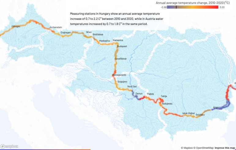
Atlo’s data journalism team mapped the warming trend of the Danube River’s water. Image: Screenshot, Atlo
Each year, climate change has made itself felt through extreme weather or natural disasters, and 2024 was no different. In Japan, an earthquake on New Year’s Day killed 474 people; in Brazil, another 183 people lost their lives in flooding in Rio Grande do Sul after record-high rains in late April; in the US there were 231 fatalities in September’s Hurricane Helene. Below, we highlight data analyses of wildfires and rising temperatures around the world.
Wildfires: There was plenty of analysis of the destruction and magnitude of wildfires in different parts of the world this year — even in the Arctic. According to this analysis by Bloomberg, there have been many more wildfires than normal in the region this year, particularly in the northern boreal forests of Canada, Europe, and the Siberian tundra. The 2024 fire season has also deeply affected the Brazilian Pantanal — the largest wetland in the world — and the peatlands of Indonesia. The report also explained with maps and graphs that what differentiates the fires in these locations is their tendency to move underground towards carbon-rich soil layers, where they burn slowly and emit large amounts of pollution — which threaten to worsen global warming.
Rising Water Temperatures: The Danube is the second largest river in Europe, behind only the Volga in Russia. Its waters cross 10 countries, with almost 900 municipalities and around 14 million people living on its banks. In this interactive special report, the Atlo Team showed, through a mapped visualization, how the river’s temperature has been steadily warming along its length over the last five decades – which has adverse effects on both wildlife and humanity. By analyzing temperature data from 34 monitoring stations along the Danube, the team revealed how the river’s average annual temperature rose from a range of 8.5 to 11.5 degrees Celsius (47 to 52 degrees Fahrenheit) in 1965 to 11.4 to 14.2 degrees Celsius (52 to 57.5 degrees Fahrenheit) in 2015.
Aircraft Accident in Japan

Image: Screenshot, Nikkei
On January 2nd, while landing at Haneda Airport in Tokyo — the busiest airport in the country — a Japan Airlines (JAL) Airbus A350 passenger jet collided with a Japan Coast Guard aircraft that was preparing to take off to deliver aid to the area affected by an earthquake. The accident caused a huge explosion and a fire that consumed both planes, causing the death of five of the six occupants of the small aircraft. On the commercial flight, all 379 passengers and the crew were evacuated in record time. To understand why the collision occurred, Japanese media giant Nikkei produced a detailed visual project using flight data, eyewitness videos, and audio from communication logs, and made a 3D-model of the aircraft and airport.
Data Broker Files
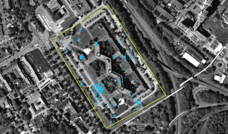
Through data brokers, Netzpolitik.org was able to obtain cell phone data that tracked people who worked at or visited (blue dots) the headquarters of Germany’s Federal Office for the Protection of the Constitution (bounded by yellow box). Image: Screenshot, Netzpolitik.org
Cell phone apps help us navigate and provide precise weather predictions, but to do this, we have to share our location. This bold visual special report from digital rights site Netzpolitik.org and the Bavarian broadcaster, BR, shows how dangerous this can be, even in a country such as Germany that has strict data privacy laws. The investigation revealed how data brokers who sell location data online — usually for advertising purposes — with little oversight are not just a threat to privacy, but to national security. The team obtained a dataset — a free sample from a data broker registered in the US — of 3.6 billion location data points in Germany that revealed the GPS locations, and hence the movements, of millions of people. They created tens of thousands of detailed movement profiles — including for apparent employees of German military and intelligence services, whom they traced going to security-sensitive locations and supermarkets, as well as holidays and business trips.
China’s Border Guardians
In 2024, GIJN featured several pieces on China’s territorial claims, with stories about the country’s disputes over control of the island of Taiwan and the waters of the South China Sea. In this interactive special report packed with aerial footage, The New York Times showed how China has invested heavily in occupying its land borders, especially its western ones, through civilian settlements. The Times used artificial intelligence to map and analyze satellite imagery to identify new villages on the border and checked them against historical imagery, state media, social media posts, and public records. According to the report, during the past eight years, China has moved thousands of people to its borders — often paying them to do so — and built more than 50 new villages along the region, including 12 in disputed areas claimed by other countries such as India, Bhutan, and Nepal. Chinese leader Xi Jinping refers to these frontier residents as “border guardians.”
Buenos Aires Crime Map
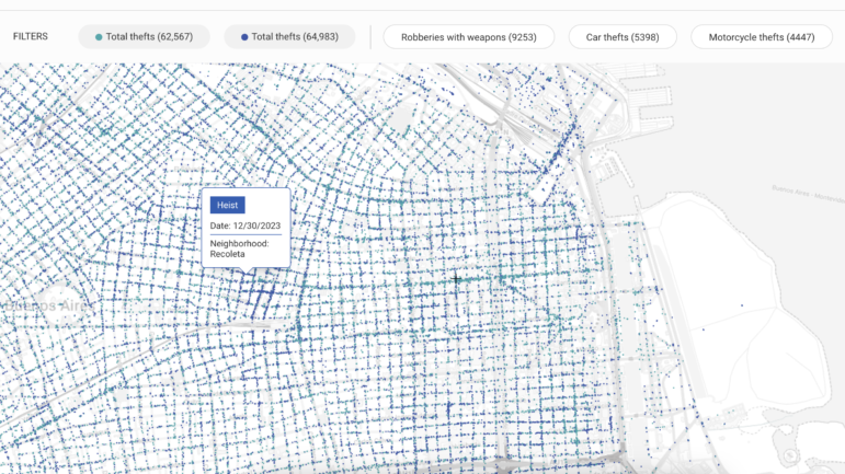
The economic crisis that has plagued Argentina — with elevated inflation rates and increasing numbers of the population living in poverty — seems far from over after controversial President Javier Milei’s first year in government. In other aspects, however, the South American country has made positive strides. According to the newspaper La Nación, although the number of robberies and thefts in the capital Buenos Aires increased last year, murders are few and have been falling steadily, making the capital one of the safest large cities in Latin America. This special project may be more useful than conventional travel guides for planning a getaway to Buenos Aires; it shows all the crimes registered in the city in 2023, geolocated. You can also feed in your location to find out how safe the area is.
2024 Olympics and Paralympics
Another topic widely discussed on social media and the subject of many data projects was the Summer Olympic Games, held in Paris for the third time.
To show what changed in the 100 years since the City of Lights last hosted the event, the South China Morning Post presented a beautiful visual explainer full of interesting illustrations, showing notable changes such as the distribution of competition venues throughout the city, the large increase in the number of athletes, sports, and delegations — including new countries — as well as how sportswear and equipment have been modernized. It also noted idiosyncrasies of certain disciplines, such as the adoption of the Fosbury Flop technique for the high jump — introduced by a competitor in 1968 — and the digital scoring system in fencing, where an electronic device on the tip of the foil registers a hit on opponents.
The Paralympics started just two weeks after the Olympics concluded, but was covered far less in media and data journalism. It is worth highlighting, however, this piece from Le Monde — part of a series of articles about the sporting event — that analyzed how inequality and discrimination against people with disabilities persists in the host country, France. The Le Monde team also compared transport accessibility data from Paris with the last two host cities, Tokyo and London, and found that only 3.2% of Parisian metro stations are accessible — a situation reporters called “catastrophic.”
Bonus: Is the Love Song Dying?
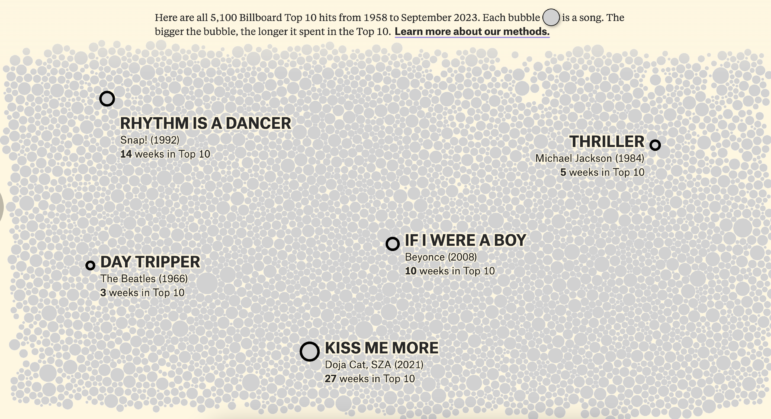
This fun visualization from The Pudding — published after our final 2024 data column — caught our attention. Their analysis is a retort to those who say that they don’t make love songs like they used to — ”that something about contemporary music is in decline.” It visualized all 5,100 Billboard Top 10 hits from 1958 to September 2023, creating an interactive chart with each song represented by a bubble and placed into a song category. Of course, many nuances must be considered when classifying a song as a love song — such as serenades, songs about breakup heartbreak, unrequited crushes, or complicated relationships. Still, the Pudding concludes: “The love song didn’t die; it evolved.”

