Hosted by Investigative Reporters and Editors, the recent NICAR 2025 data journalism summit unpacked a treasure trove of investigative tools and techniques for the 950 attendees and data experts gathered in the US city of Minneapolis over four days in March.
GIJN will dig into these cutting edge resources and highlight techniques that we think are most useful for the international investigative journalism community in a series of stories in the weeks ahead. In this first installment, below, we share some of the no-cost, easy-to-use digital tools that NICAR speakers described as both surprisingly useful and generally underused by reporters.
Summarize.Tech
Hours-long public events that are of interest to journalists — whether parliamentary hearings, regulatory agency meetings, or live events — are routinely uploaded to YouTube in many countries around the world. But few reporters have the time to watch and transcribe highlights of videos that run for one or more hours.
But one AI-powered tool featured at NICAR25, Summarize.Tech, offers a remarkably simple time-saving coverage solution. You simply paste the video URL into the search bar, hit ‘submit’, and wait about a dozen seconds to find a detailed and fairly reliable summary of the discussion. In addition, the tool also enables journalism-level reliability by embedding timeline links, so reporters can click on those links to directly hear the newsworthy remarks highlighted in the summary. You can also view transcriptions of meetings already created by other users. One caveat: the service only allows five free uploads per month.
“I uploaded a video of a school board meeting of about an hour-and-a-half, and it took about 10 seconds to generate this great summary of what happened during this meeting,” explained Cynthia Tu, a data reporter at Sahan Journal. “And when you click on ‘see more,’ it summarizes the content of the meeting by five-minute increments. What’s unique is that you can click on the timeline links and it will actually take you back to that moment in the video.”
She added: “The downside of this tool is that summaries for videos that are not in English are not as reliable. But I think it’s a great tool, so give it a go.”
Vessel Viewer
While many investigations have been enabled by excellent subscription-based ship tracking tools such as MarineTraffic, one NICAR session highlighted a similar, free tracking tool that includes several journalist-friendly features. Developed by GlobalFishingWatch and fisheries intelligence nonprofit TMT, Vessel Viewer offers basic and advanced search options for almost 100,000 ships — both fishing and non-fishing vessels — from public registries, as well as port visits and detailed voyage monitoring data going back to 2012.
Describing one recent maritime disaster investigation, Logan Williams, a senior researcher at Bellingcat, said the tool had helped reveal accountability evasion efforts by ships’ officers. “There are great tracking resources out there, but my personal favorite is this tool,” he said. “It’s totally free, and they provide lots of access for downloading current and historical AIS [automatic identification system] data. [In our investigation,] you can see the route the ship took; where its voyage started — and you can also see interesting gaps where the ship turned off its location transmitter.”
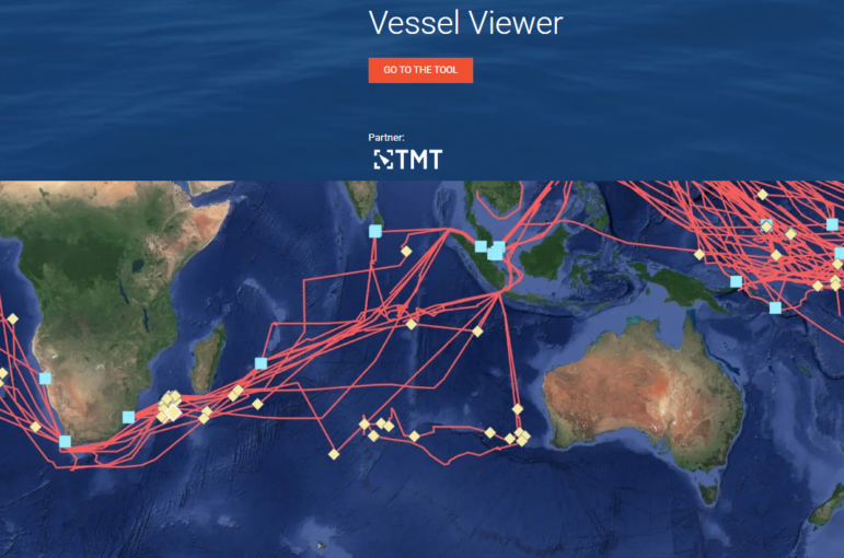
A sample of shipping route tracks on Vessel Viewer. Image: Screenshot, Vessel Viewer
Free.law/RECAP
A vast number of international disputes, sanctions-busting trials, and multinational company disputes appear in court filings or exhibits throughout the US federal courts system. While the US offers one of the world’s most comprehensive systems for digital court document access via the PACER tool, the problem — as both US and international reporters often lament — is that you have to pay to download these public documents, sometimes at great cost for lengthy filings.
However, an extension called free.law/RECAP offers a no-cost workaround, allowing reporters in any country to search its vast archive of previously uploaded court documents at no charge. In addition, a tool called courtlistener.com/recap will send you alerts for any new filings in a case you’re following, which you can learn how to use online.
“RECAP is operated by the Free Law Project, which is a group that shares [reporters’] deep and abiding rage that we have to pay for federal court documents,” said Tyler Dukes, editor for AI innovation in journalism at McClatchy Media. “Whenever someone with this extension pays for a document, the system automatically uploads that document to Free Law’s document database. So anyone who wants that document next will get it for free. The chances are that some lawyer somewhere, or another journalist, has already paid for that document. It also works for specific exhibits. You can also get alerts for cases you’re watching, which is a really good resource.”
RAWGraphs
While excellent visualization tools such as DataWrapper and Flourish are frequently used in published investigations, reporters often need simple, fast graphical depictions of their data during the reporting process. In addition to guiding your understanding of complex data as you gather it, it’s often helpful to have a simple bar chart, matrix plot, or bubble chart to show your editor or a potential source.
Pooja Dantewadia, data journalist at Realtor.com and a former graphics reporter at The Los Angeles Times, said the open source RAWGraphs web app is not only ideal for briefings and brainstorms, but is also useful for rapid chart choices and published graphics on deadline.
RAWGraphs “is amazing in terms of quickly turning data into visuals,” Dantewadia noted. “It’s great if you want quick analysis of data, and to quickly see what kind of chart would be most appropriate, so your editor can quickly see what the data is showing. It’s great for brainstorming. And you don’t even have to sign up — that’s how quick it is.”
The app includes 30 chart models, from Sankey diagrams to heatmaps, and its Youtube channel offers helpful tutorials on how to build and export each one. According to the website, data you upload to the tool should be secure because “the data you insert will be processed only by your web browser.”
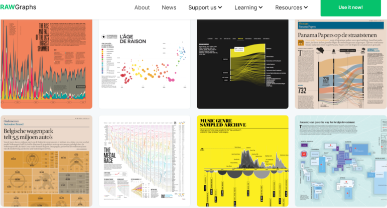
A sample of chart types in published articles using the free RAWGraphs tool. Images: Screenshot, RAWGraphs