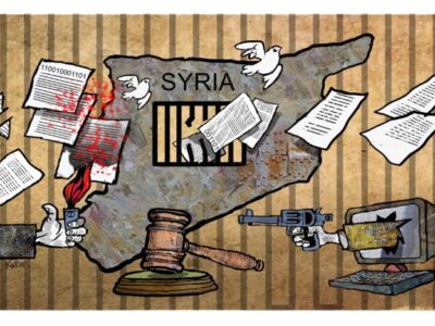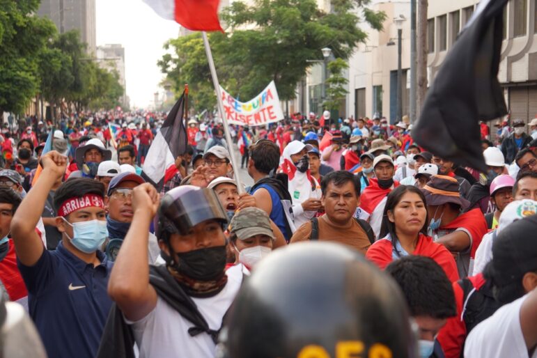
From the war in Gaza and its spillover into Lebanon and surrounding countries to the fall of the Assad regime in Syria, data journalism in the Middle East and North Africa region has become an indispensable medium for documenting major and often fast-changing events on the ground. It has brought to light the emerging patterns of conflict and the deep relationship between data and on-the-ground reporting, and its importance in a region often facing challenges of access and controlled narratives.
Data journalism in the region has been driven by a handful of organizations that have worked consistently, in some cases for more than a decade, to create outlets, collaborations, and projects informed by local knowledge and a nuanced understanding of the sociopolitical landscape — despite the challenges of access to reliable data and security risks.
Organizations such as the Yemen Data Project (YDP) and Visualizing Palestine (VP) stress the importance of working with researchers familiar with the biases and limitations of available data and who question conventional narratives. Data collection and visualization are also essential tools for accountability and global legal impact. The Ericsson List leaks, for example, an International Consortium for Investigative Journalism (ICIJ) investigation in collaboration with Arab Reporters for Investigative Journalism (ARIJ) and other media partners across 22 countries exposed corporate corruption and complicity in conflict zones, prompting legal probes.
YDP’s meticulously compiled airstrike data from the Yemen conflict has been used in a UK High Court case and cited by lawmakers worldwide to assess arms sales to Saudi Arabia. Similarly, Visualizing Palestine’s visuals and interactive platforms have provided legal experts with evidence for war crimes investigations, demonstrating the crucial role of data in international justice efforts. Al Jazeera’s visual storytelling team, AJ Labs, produced a data-driven reporting project documenting the lives lost in the Gaza war.
Data Storytelling for ‘Narrative Change’
For more than a decade, Visualizing Palestine has been creating infographics that distill vast, intricate issues surrounding Palestinian life — ranging from hunger strikes to forced displacement and the starvation crisis in Gaza — into striking, impactful visuals.
VP’s eight-member team, spread across Palestine, Egypt, Lebanon, and the United States, frequently collaborates with external designers and researchers to amplify their message. Aline Batarseh, the group’s executive director, notes that since 2016, more than 160 contributors and creative collaborators have worked with VP. One of those collaborations was with Human Rights Watch’s 2021 report on Israel’s policies towards Palestinians, including complaints about persecution and crimes against humanity, which included VP infographics.
Batarseh says the biggest challenge facing VP is countering how Palestinians have been portrayed in the media and trying to bring to light their daily struggles. Compounding this issue is how quickly data becomes obsolete, particularly in relation to Israel’s ongoing strikes in Gaza. For instance, figures from their Zero Accountability Project quickly became outdated as the destruction of Gaza’s healthcare infrastructure rendered the Palestinian Ministry of Health unable to collect accurate casualty numbers.
When VP was founded in 2012, data storytelling was still an emerging tool in the region, especially in the realm of community-based social justice communication. VP’s debut visual, Hunger Strikes, illustrated the physical toll of prolonged hunger strikes by Palestinian prisoners, gaining significant traction on social media. Batarseh notes that it “signified the promise of digital media as a space where Palestinian stories could be told in ways that were not possible before.”
“Visualizing Palestine’s data visualization plays multiple roles: the aim of our visuals is not only to document, uplift, and center Palestinian narratives and experiences that are deliberately obscured by dominant narratives, but to compel activists, students, and educators to utilize our visuals for education, awareness raising, and organizing purposes,” says Batarseh.
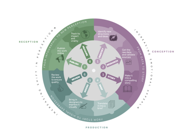
Visualizing Palestine’s process wheel. Image: Screenshot, Visualizing Palestine
Monitoring the Impact of War with Open Source Data
In the first two years of its existence, the Yemen Data Project, a group of academics, human rights organizers, and activists, had no funding and were running everything “off a shoestring” to record airstrike data of the Saudi bombing campaign in Yemen, which began in 2015. That data became a detailed record of war.
After the UN Human Rights Council (UNHRC) in 2021 ended its mandate to investigate war crimes in Yemen, reportedly due to Saudi lobbying, Saudi-led airstrikes increased significantly. Leveraging historical data, the Yemen Data Project (YDP) documented a sharp rise in civilian harm rates and per-strike casualties, establishing a direct correlation between the absence of international oversight and intensified air raids. YDP’s findings became a critical source of evidence, cited globally by lawmakers, media outlets, and in a UK High Court case, which led to the 2019 suspension of British arms sales to Saudi Arabia. This case highlights the crucial role of data journalism in exposing patterns of violence and holding powerful actors accountable.
It wasn’t until YDP handed their air strikes data to the Guardian, where its journalists spent three months trawling through the data set, that analysis of Saudi-led airstrikes showed they regularly hit civilian, economic, and cultural sites.
“Overnight, the Yemen Data Project was born,” explains Iona Craig, a British freelance journalist who represents YDP publicly. “Without that initial reporting from the Guardian, the YDP would never have existed, and those civilian deaths would never have been counted and recorded.”
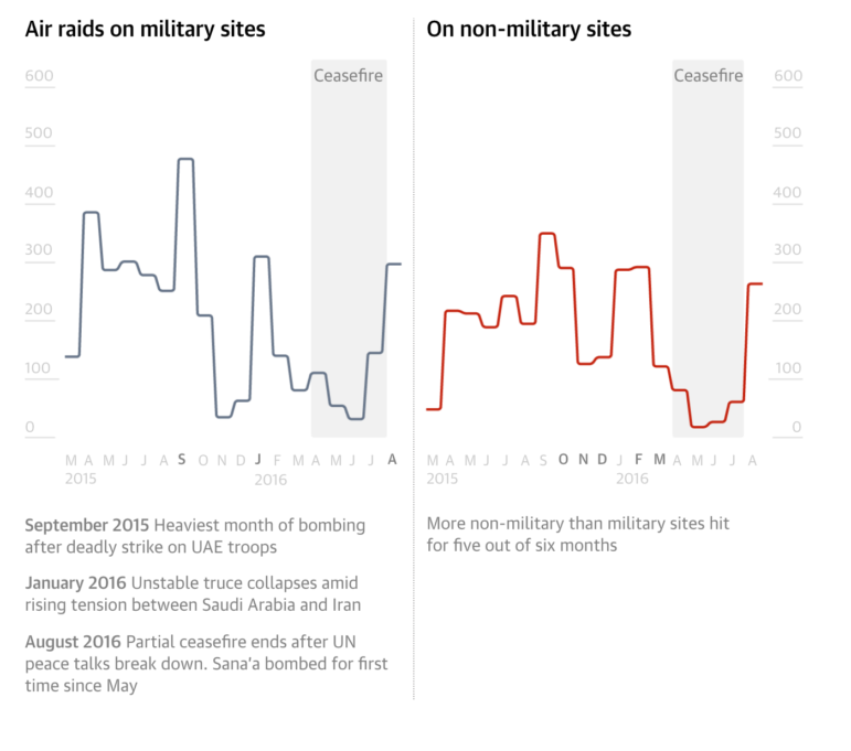
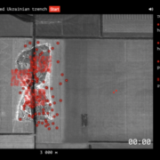
Image: Screenshot, Yemen Data Project
The YDP relies on Yemeni data collectors and researchers on the ground to do open source collection, such as gathering civilian casualty data. But to maintain the security of those working in Yemen, Craig is the only public face of the project.
“I still do reporting trips to Yemen, which means there’s always the risk of being detained. As strange as it may sound, for that reason, I don’t even know the identities of our team in Yemen,” says Craig.
Craig emphasizes the value of data collectors with local knowledge, who understand reporting biases from sources and can instead draw on an array of open sources and materials. While it’s an imperfect way to collect data, it is safe and consistent, she explains. “It means that governments or authorities who wouldn’t necessarily tolerate critical reporting or an independent press are less concerned about data collection when it’s all coming from existing open sources and the data that’s collected is publicly available.”
In addition to the relevance of having on-the-ground research, Craig highlights the importance of using a methodology that’s in line with best practices, which is why YDP is part of the Casualty Recorders Network — a platform that has seen the development of the Standards for Casualty Recording, which has played a crucial role contributing to global research on documenting casualties, including various United Nations studies.
“YDP was set up with the purpose of increasing accountability and promoting transparency. Accountability in that context relies on the integrity of our data,” says Craig.
YDP’s data has also been used in academic research, public health studies, and investigative journalism, most notably in The Lancet’s research linking airstrikes to Yemen’s cholera epidemic. The study found that areas experiencing frequent air raids had double the risk of cholera outbreaks, demonstrating the devastating impact of war on public health and setting a precedent for understanding conflict-related disease spread.
“This research was not just important for Yemen, but as a warning of the health impacts for civilians in extended bombing campaigns,” says Craig.
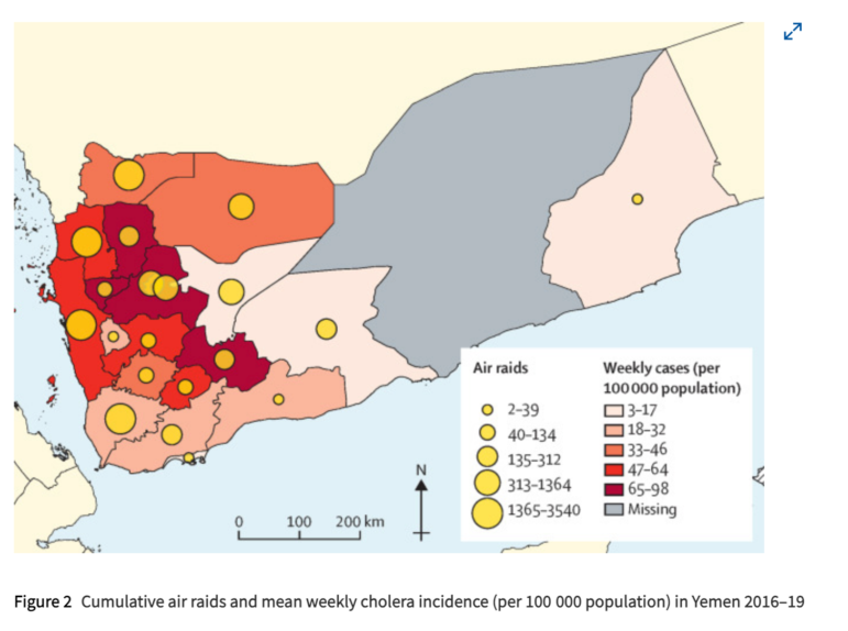
Cholera outbreak data from the Yemen Data Project appearing in The Lancet medical journal article: “Association between air raids and reported incidence of cholera in Yemen, 2016–19: an ecological modelling study.” Image: Screenshot, The Lancet
Finding the Hidden Connections
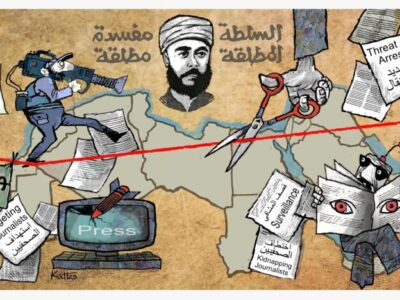
The Arab Reporters for Investigative Journalism (ARIJ) has been at the forefront of investigative journalism in the Middle East and North Africa since it was established in 2005. By providing training, resources, and a collaborative platform, ARIJ equips journalists to uncover stories of significant public interest, often in challenging environments marked by censorship and political pressures.
Senior data editor and coach at ARIJ, Mohammed Komani, explains that often the lack of government transparency and tightly controlled information means that available data quickly becomes fragmented and outdated, resulting in the reliance on open data initiatives, international datasets, and techniques such as web scraping to build datasets from the ground.
“Data is a vital tool in our accountability efforts. By carefully analyzing financial records, government spending, corporate disclosures, and even data on human rights and gender issues, we can expose corruption, mismanagement, and conflicts of interest,” Komani says. “The datasets we work with help us to identify hidden connections that might be overlooked by conventional reporting.”
There’s also an emphasis on understanding the local legal landscape as well as promoting digital security to protect sources and data. The evidence-based and multifaceted approach by Komani and ARIJ is fundamental to their Data Journalism Diploma, a training course that attracts hundreds of journalists each year. In his role, Komani equips journalists with the skills needed to work on data-driven investigations, taking them through the entire data pipeline from data collection and cleaning to analyzing and visualizing using tools such as Excel/Google Sheets, Python and OpenRefine and visualization tools such as Tableau, Datawrapper, and Flourish, as well as methods such as open source research.
One of Komani’s most recent and impactful investigations centered on the Ericsson List leaks — conducted in collaboration with ICIJ and other global media partners — which exposed allegations of corruption and illicit payments by the Swedish telecommunications company in conflict zones, including Iraq. Leaked documents suggested that Ericsson employees were involved in bribing armed groups, including ISIS (ISIL), to secure operational access in areas under militant control. Reports revealed that these payments may have indirectly funded terrorism, raising serious concerns about corporate complicity in human rights violations.
The investigation also highlighted Ericsson’s failure to protect its contractors, some of whom faced kidnappings and violent attacks due to the company’s negligence. The revelations had significant repercussions, leading to global scrutiny, legal probes, and financial instability for Ericsson, with analysts warning that its shares risked becoming “uninvestable.” In response to the investigation, Ericsson stated that several employees had been let go, the company had terminated some third-party relationships, and that “multiple other disciplinary and other remedial actions were taken” after it had investigated misconduct in Iraq.
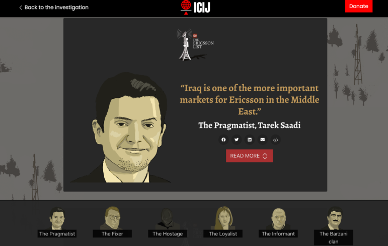
Image: Screenshot, ICIJ
Compelling the Audience to Focus
Over the past 17 months, AJ Labs — Al Jazeera’s visual storytelling team — has placed the Gaza war at the heart of its reporting, with a standout focus on Know Their Names — a visual series chronicling the thousands of lives lost. Spanning five installments, the series has put a human face to the war’s toll, using data to spotlight individuals, families, children, and journalists across Gaza and the occupied West Bank. To move beyond mere numbers, the team has woven together video testimonies, animations, and graphics, ensuring that each statistic carries the weight of a personal story. (Note: this article’s author is also employed as a data journalist at AJ Labs.)
“Telling the story of a dead child is never easy,” Mohammed Haddad, editor of AJ Labs, says. “Yet when the numbers rise into the tens of thousands, it becomes almost impossible to comprehend. There is always a fear that each child might become just another statistic.”
This, he explains, is why creative and unconventional storytelling methods are vital, in which approaches don’t just present information but demand the audience’s attention.
Beyond humanizing data, the team has increasingly turned to open source intelligence, including satellite imagery. “I’d say that especially over the past couple of years, working with our fact-checking unit, Sanad, the team at AJ Labs has increasingly relied on satellite image analysis to report on stories from Gaza, the occupied West Bank, Syria, Lebanon, and Sudan,” says Haddad.
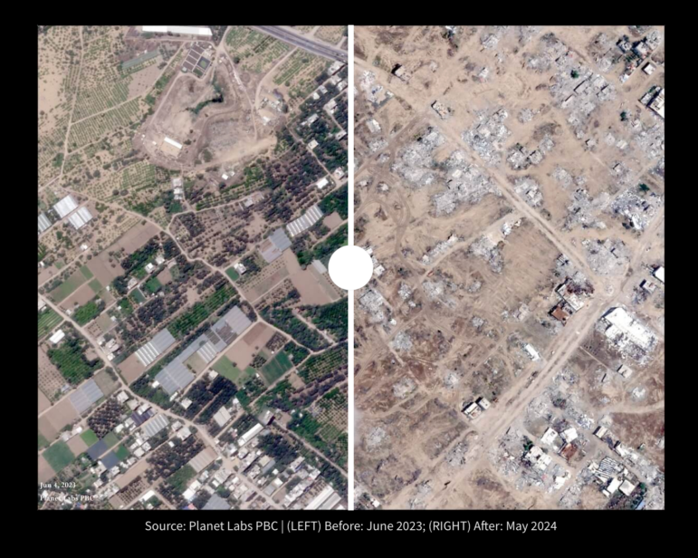
Satellite images showing the scale of destruction in Gaza between June 2023 (left) and May 2024 (right). Image: Screenshot, AJ Labs / Planet Labs PBC
For Haddad, pairing on-the-ground reporting with a data-driven aerial perspective is essential, adding depth, context, and a broader understanding of events. But more than mastering tools, he believes the most valuable skill for any data journalist is the ability to think critically and shape a compelling narrative.
“I’ve found that young data journalists often focus too much on trying to learn the tools and not enough on how to shape the data into a clear narrative, resulting in an output that delivers more data to the reader rather than telling a compelling story.”
Instead, Haddad argues, the emphasis should be on integrating AI technologies into newsrooms, not as a replacement for journalists but as a way to streamline data processes. His team has been actively exploring AI applications that enhance efficiency in data storytelling.
“I know AI is all the rage these days, but I believe data journalists will benefit the most from it, particularly cleaning, processing and interviewing data,” he adds.
At the core of AJ Labs’ approach is a commitment to resonance and local knowledge that speaks directly to their audience. A prime example is their recent piece, Ever Wonder Why Africa’s Borders Appear So Strange?, which struck a chord precisely because it broke down historical and geopolitical contexts that make complex issues accessible, relevant, and deeply understood where one graphic can tell a whole story.
“We design our infographics in such a way that, on their own, they tell a complete, albeit condensed story. When viewed as a series, they offer a broader perspective, helping readers understand complex global issues more clearly,” says Haddad.