Data journalists have been busy in recent weeks with US President Donald Trump’s many controversies, whether it’s his trade war, sweeping USAID cuts, or his belligerent stances on the Russia-Ukraine war. In the run-up and after, Germany’s federal election also dominated the work of data journalism teams around the world, with polls and election forecasts, live trackers, and overviews of the voting results. This edition of our Top 10 in Data Journalism, which considered stories between February 15 and March 7, also highlights a Bloomberg analysis of satellite images showing the destruction of buildings in the Gaza Strip; Al Jazeera’s visual explanation of African countries’ borders; and Spain’s three-decades-old prison release algorithm.
Donald Trump’s Tariff Wars
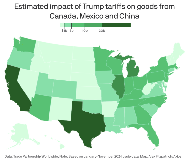
Image: Screenshot, Axios
Since returning to the White House less than two months ago, Trump has imposed import duties on goods from the country’s three largest trading partners — China, Canada, and Mexico — and on all steel and aluminum imports. While he has walked back and also re-implemented — sometimes just hours or days later — some aspects of the policy, he promises more tariffs, including on EU and UK goods. But how will this affect the wallets of ordinary Americans? According to this data analysis from Axios, Trump’s trade war threatens to raise prices on everything from food and clothing to cars and computers — not counting the retaliatory tariffs that most affected partners have already promised. According to the report, more than 40% of all imports to the US come from its three largest trading partners — more than $1.3 trillion in 2024 alone, according to Census data.
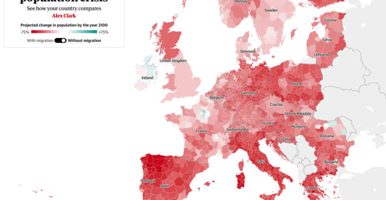
Europe Without Immigrants
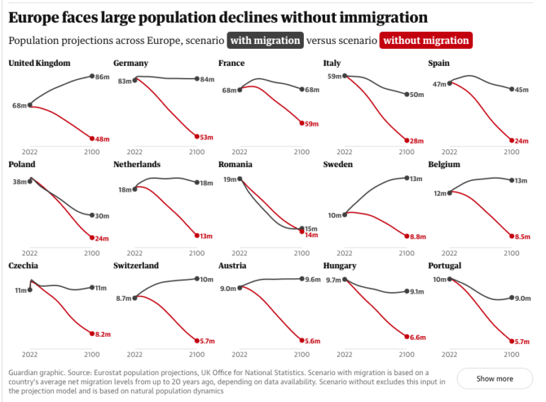
Image: Screenshot, the Guardian
According to this special report by the Guardian, the rise of far-right parties in Europe could accelerate the continent’s population decline. As birth rates fall across much of the world, Europe’s population is set to fall dramatically over the next century, and without immigrants, the rapid aging of the population will come with a series of economic challenges, such as a shrinking workforce and rising spending on care for the elderly. The report featured graphs showing population projections in different European countries in scenarios with and without migration, the percentage of European health systems that rely on immigration, and an interactive map showing the projected change in the bloc’s population by the year 2100. According to the latest projections produced by Eurostat, the continent’s population will be 6% smaller in 75 years.
Overview of the German Federal Elections
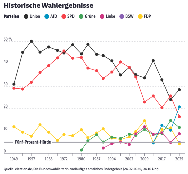
Performance of parties, by electoral percentage, in German federal elections over the past 76 years. Image: Screenshot, Süddeutsche Zeitung
Germany’s federal election was held on February 23. The center-right Christian Democratic Union (CDU) was the big winner with 28.5% of the vote, followed by the far-right Alternative for Germany (AfD), which doubled its share of the vote, to 20.8%. The Social Democratic Party of Germany (SPD), led by current Chancellor Olaf Scholz, came in third, with its worst result in a federal election. The Bavaria-based newspaper Süddeutsche Zeitung provided an overview, with comparative graphs between the 2025 and 2021 elections, as well as historical results for the seven main parties and a tool to track possible coalitions.
To go deeper, check out this Die Zeit election special that showed the new composition of the Bundestag with all 630 members of parliament in an interactive graphic and a series of charts on the demographics of the newly elected members.
Russian War Dead, Three Years On
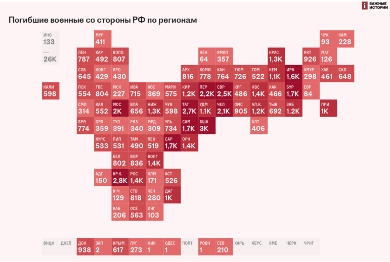
A map showing the distribution of dead soldiers by regions of Russia through 2023. Image: Screenshot, IStories
As the world awaits a possible ceasefire between Russia and Ukraine, the third anniversary of Russia’s invasion has passed. During this time, Ukraine lost many strips of land, recovered others, millions of Ukrainians have been displaced, and thousands have been killed or injured on both sides of the conflict. But according to IStories, the Kremlin is hiding data on its total war dead, which the site documents through open source data to be around 104,000 killed through February 25, 2025. (Other estimates put the number as high as 160,000.) To get around this blackout, the exiled Russian outlet launched the Charon project — a regularly updated database of dead and missing Russian soldiers, compiled from various sources. It’s possible to search for individuals, estimates of casualties by region, age, places of death, and disappearance, among other information. (The project is named after the Greek mythological figure who transports souls to the realm of the dead.)
Also interesting: this CNN piece provides a visual analysis of the three years of war, looking at how Ukraine has changed in the period since Russia’s full-scale invasion.
Satellite Images of the Destruction of Northern Gaza
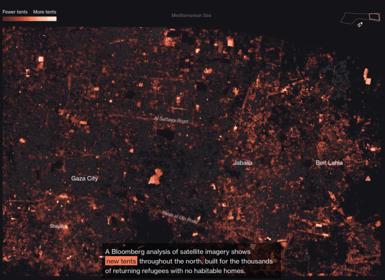
Image: Screenshot, Bloomberg
Since a ceasefire agreement between Israel and Hamas was declared in January, millions of Palestinians have been returning to their homes in the Gaza Strip — or what’s left of them. According to Bloomberg, only 28% of the buildings in the northern provinces of Gaza and Gaza City are intact, which corresponds to about 35,000 buildings with no detected damage. Bloomberg analyzed satellite images of the region and showed through maps what is still standing, and how Gazans have repopulated the main cities in the north with tents and tarps, with new temporary facilities built for the thousands of refugees returning to inhabitable homes.
Brief Geographical History of Africa’s Borders
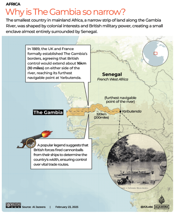
Image: Screenshot, Al Jazeera
The African continent has the largest number of countries — 54. This diverse region is also full of curious stories: Have you ever wondered why The Gambia, continental Africa’s smallest country, is so narrow, why Lesotho is encircled by South Africa, or why three African countries are called Guinea? In this visual explainer, Al Jazeera explores the stories behind the map of Africa and the continent’s most unusual borders, explaining how nations ended up landlocked or with straight-line borders that cut through mountains, rivers, and even communities. According to the report, these cases are rooted in the continent’s colonial past, when borders were determined according to colonizers’ interests — such as the need for access to a certain river or the location of oil reserves. Most of Africa’s artificial borders date back to the Berlin Conference of 1884-85, when European powers divided the continent among themselves.
Spanish Prisoner Releases Rooted in the Past
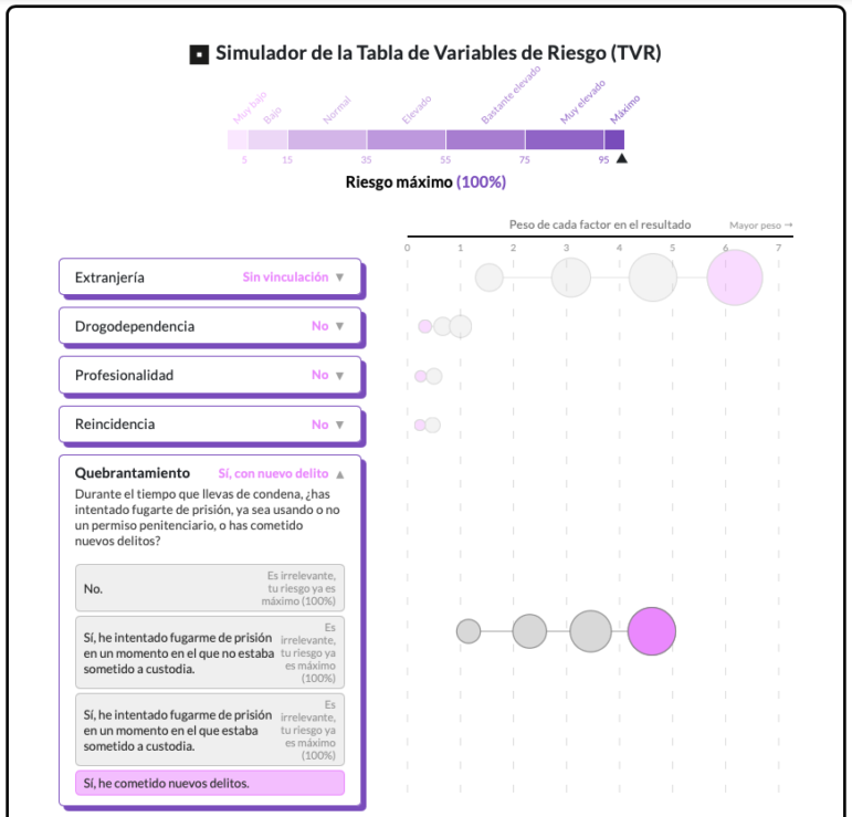
Image: Screenshot, Civio
In this special report, public transparency nonprofit Civio detailed how Spanish prisons still use an algorithm from 1993 to approve or deny release authorizations. According to the report, the Table of Risk Variables (TVR, in the Spanish acronym) algorithm was commissioned 32 years ago by the Spanish Ministry of Justice — to provide a certain level of certainty when deciding whether to release inmates. The TVR was based on a study of almost 1,500 prisoners and identified a total of 10 risk factors, including being a foreign national. To date, the algorithm has had only one update, back in the early 1990s, but it is still widely used. In 2024 alone, the TVR was cited in at least 250 decisions by various provincial courts as a reason for denying or granting authorizations.
Massive Cuts in US Foreign Assistance
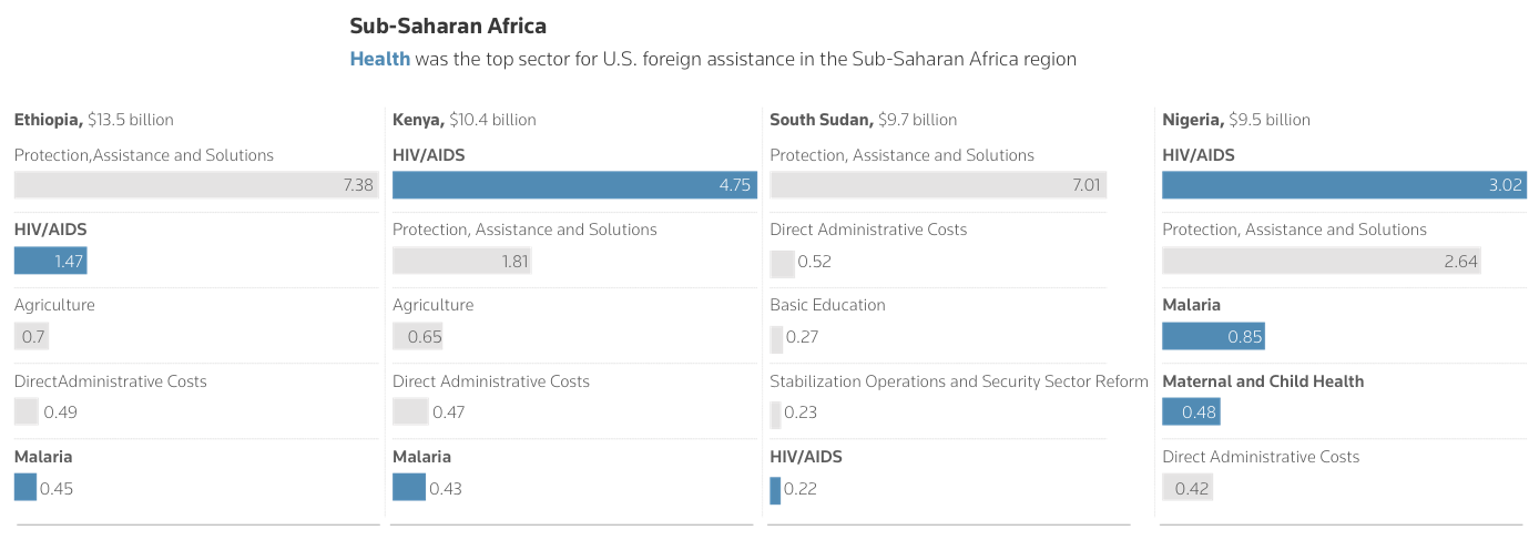
Image: Screenshot, Reuters
Hours after taking office on January 20, Donald Trump ordered a 90-day pause on all US foreign assistance. This week, Secretary of State Marco Rubio said that the United States Agency for International Development (USAID) — once the world’s leading source of international aid — would cut about 83% of its programs. According to Reuters, the effects of this reduction could have global repercussions, especially for countries in Africa and the Middle East. The report included a series of charts that show, for example, how the US is the country with the largest share of foreign assistance among developed countries and how foreign assistance is provided by different US government agencies — with USAID accounting for half of obligations and disbursements. It also presented the figures for different types of aid, the percentage of foreign assistance received from the US in different parts of the world, and a breakdown by region.
China’s State-Backed Housing Market
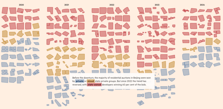
Image: Screenshot, Financial Times
In this visual interactive, the Financial Times explained how the Chinese state is propping up the country’s property market. According to FT’s analysis, following the property crisis that began in 2021 developers have continued to buy residential land, but buyers have shifted. While most residential auctions were previously won by private or mixed-ownership groups, the trend has reversed since 2022. The report used satellite imagery and mapping to show plots of land in Beijing and who owns them: state-owned, private, or mixed-ownership. It also documented how the slowdown in land sales is starting to trickle down to construction, and how state-backed property developers are winning the majority of residential land auctions in the Chinese capital.
The Economist visualized the results of a study published in the journal Nature Medicine that analyzed genetic and environmental factors that most help people live longer in the United Kingdom. According to the report, the data covers genetic, medical, income, lifestyle, and upbringing information from half a million people in that country.
Among the study’s conclusions: age and sex explain 47% of the variability in mortality, while environmental and lifestyle factors explain 17%, and genetics only 3%. The study’s authors identified the environmental factors with the strongest influence on mortality, which include obvious conclusions such as the negative effects of smoking, consistent physical exhaustion, and unhealthy sleep patterns. Physical activity, greater years of education, and higher household income correlate to lower mortality risk. But other, not-so-predictable findings suggested that social connections can be key to a long life. Those results from the study showed that social connections — like living with a partner or having other people in the household — may be as important as physical exercise in avoiding an early death.
Bonus: FiveThirtyEight Shut Down, Most of Its Data Deleted

Image: Screenshot, FiveThirtyEight, ABC News
Some sad news for the data journalism community: the polling analysis site FiveThirtyEight — also known by the numerals 538 — has closed down. The site was launched in 2008, was part of The New York Times and ESPN at various points, and had been run by ABC News since 2023. While the website is no longer online, a few pieces have been archived, including this last hurrah, an interesting prediction of the possible Oscar winners, taking into account probabilistic models and the statuettes awarded by other awards.